Choosing the right colors in senior living facilities is crucial for creating a comfortable and supportive environment. Colors significantly influence mood and well-being, with certain hues promoting calmness, safety, and a sense of home, while others can energize or overstimulate. Understanding these effects helps design spaces that enhance the residents’ quality of life.
Calming and soothing colors
Benefits of using soft blues, greens, and neutrals:
- Soothing and stress-relieving: Soft blues and greens are known for their calming effects, which can help reduce stress, anxiety, and agitation among seniors. These colors evoke a sense of tranquility and peace, contributing to overall emotional well-being.
- Enhanced relaxation and rest: These colors are ideal for promoting relaxation, making them suitable for spaces where seniors need to unwind and rest. Neutrals provide a balanced backdrop, allowing the calming shades to stand out without being overwhelming.
- Improved cognitive function: The serene nature of cool colors can help maintain focus and mental clarity, which is particularly beneficial in spaces like reading rooms or activity areas.
- Universal appeal: Soft blues, greens, and neutrals have a wide appeal and are generally well-received by people of all ages, making them ideal for communal spaces where different generations might interact.
Recommended spaces for these colors:
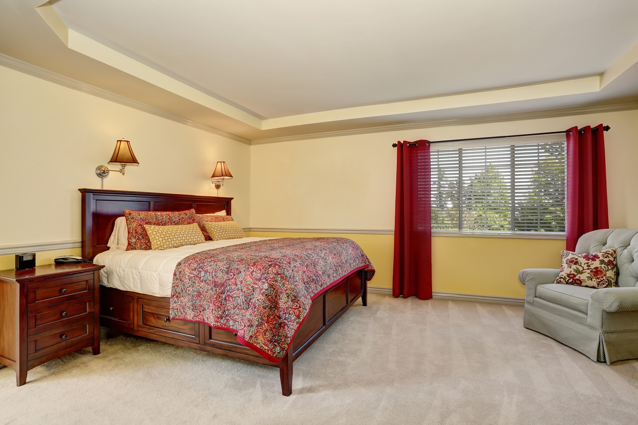
- Bedrooms: Soft blues and greens create a restful environment, ideal for promoting sleep and relaxation. Neutral tones can be used for bedding and furniture to maintain a soothing atmosphere.
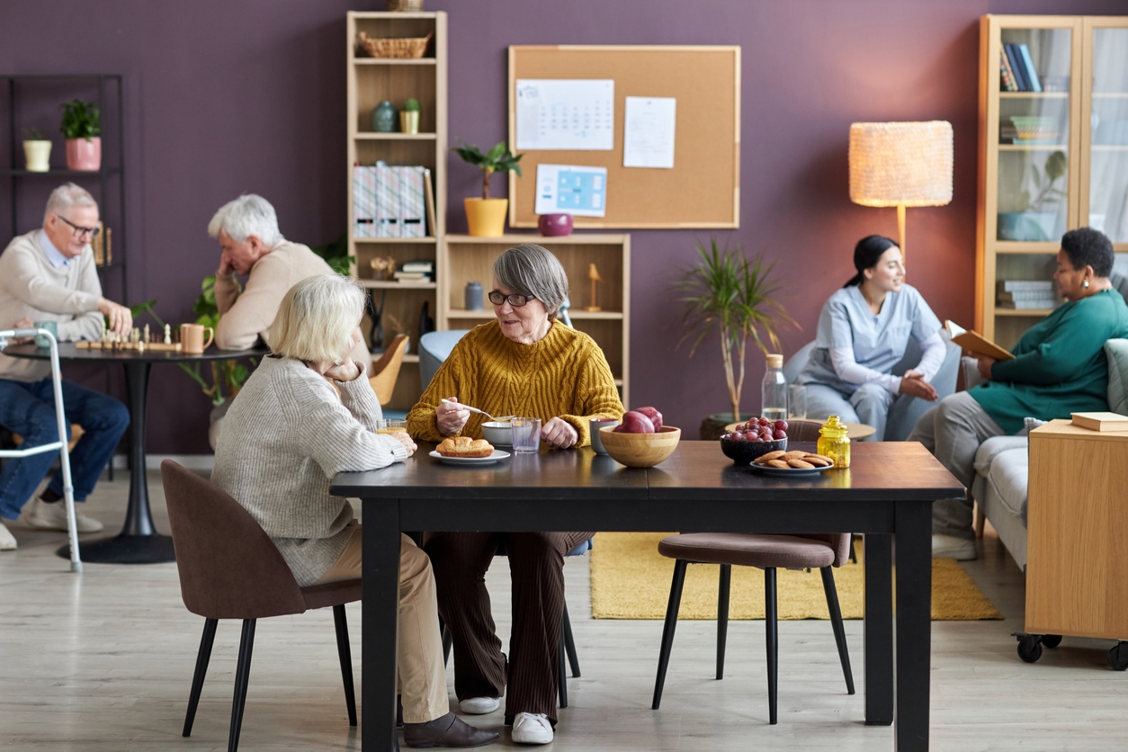
- Common areas: Living rooms, lounges, and activity rooms can benefit from these calming colors to encourage social interaction in a relaxed setting. These colors can also help in reducing overstimulation in busy areas.
- Dining areas: Soft greens and neutrals can be used in dining spaces to create a pleasant and inviting atmosphere that encourages a calm and enjoyable mealtime experience.
- Bathrooms: Light blues and greens are ideal to create a spa-like, refreshing atmosphere that promotes comfort and relaxation.
Stimulating and energizing colors
In senior living facilities, stimulating and energizing colors like yellows and reds can be used to enhance mood and energy levels.
- Yellows: Bright and cheerful, yellow can create a lively atmosphere, promoting positivity and social interaction. It’s best used in spaces where residents gather and engage in activities, such as activity rooms, common areas, and dining rooms. Soft yellows can be used in corridors to create a warm and inviting path between spaces.
- Reds: Red is a powerful and stimulating color that can boost energy and appetite. It is ideal for dining areas to encourage engagement and liveliness. However, it’s important to use red in moderation, perhaps as an accent color, to avoid overstimulation. It can also be used in recreational or game rooms to energize the space, fostering a sense of excitement and activity.
Balancing these vibrant colors with softer tones ensures that the environment remains welcoming and not overwhelming.
Colors for cognitive and emotional support
Use of colors to aid memory and reduce anxiety
Using colors for cognitive and emotional support involves thoughtful choices that can aid memory retention and reduce anxiety. Soft pastels, like light blues, pinks, and lavenders, are known to create a calming environment, which can help in reducing anxiety. Earth tones, such as muted greens, browns, and soft beiges, can provide a sense of stability and grounding, which is beneficial for cognitive support.
Areas where these colors are beneficial
These colors are particularly effective in areas like hallways, where they can help guide individuals calmly through spaces, and in therapy rooms, where a tranquil environment is crucial for effective treatment and relaxation.
Practical considerations
When choosing paint for senior living facilities, two key considerations are durability and maintenance, especially in high-traffic areas, and balancing aesthetics with functionality and safety:
Durability and maintenance
Senior living facilities often experience heavy foot traffic, particularly in common areas like hallways, dining rooms, and activity spaces. Choosing high-quality, durable paint with a finish that resists scuffs, stains, and frequent cleaning is crucial. Semi-gloss or satin finishes are often recommended for these areas as they balance durability and ease of maintenance, allowing for regular cleaning without compromising the paint’s appearance.
Balancing aesthetics with functionality and safety
While aesthetics are vital in creating a welcoming and homely environment, functionality and safety must take precedence. Paint colors should be chosen to enhance the facility’s visual appeal and support the residents’ needs.For instance, lighter colors can improve visibility, aiding those with visual impairments.
Low-VOC (volatile organic compounds) paints are essential to ensure indoor air quality and reduce potential health risks. Anti-microbial or mold-resistant paints are also valuable in maintaining a hygienic environment, especially in moisture-prone areas like bathrooms and kitchens.
Balancing these factors ensures that the paint choices contribute to a safe, comfortable, and aesthetically pleasing environment for residents.
Common mistakes and how to avoid
When selecting colors for senior living facilities, it’s essential to consider aesthetic and functional aspects to create a supportive environment. Here are some common mistakes and tips on how to avoid them:
Frequent errors in color selection
- Overuse of bold and stimulating colors: Using too many vibrant colors like bright reds or oranges can be overwhelming and cause anxiety or overstimulation for residents.
- Ignoring contrast for visibility: Low contrast between walls, floors, and furniture can make it difficult for residents with impaired vision to distinguish between surfaces, leading to an increased risk of falls.
- Lack of cohesiveness: A disjointed color scheme across different areas can create confusion and discomfort, making it harder for residents to navigate the space.
- Choosing colors based on trends: Following current design trends without considering the specific needs of seniors may result in an environment that is visually appealing but not supportive of their well-being.
- Underestimating the impact of lighting: Poor lighting combined with the wrong color choices can distort color perception, making spaces appear dull or harsh.
Tips for creating a harmonious and supportive environment
- Balance vibrant colors with calming tones: Use stimulating colors like red or yellow in moderation, focusing on areas where energy and social interaction are desired, such as activity rooms. Balance them with calming tones like soft blues, greens, or neutrals in relaxation spaces like bedrooms and common areas.
- Prioritize high contrast: Ensure adequate contrast between walls, floors, and furniture to enhance visibility. For example, darker flooring with lighter walls can help residents distinguish boundaries more easily.
- Create a cohesive color scheme: Develop a color palette that flows smoothly from one area to another, using variations of similar colors to create a sense of continuity. This helps reduce confusion and create a more welcoming environment.
- Consider the residents’ preferences and needs: I Incorporate input from residents and staff when selecting colors, focusing on choices that cater to the seniors’ emotional and cognitive needs rather than solely following trends.
- Adjust colors according to lighting: Test color choices under the facility’s actual lighting conditions. Consider how natural and artificial light will affect color perception throughout the day to ensure the environment remains comfortable and visually pleasing.
Conclusion
When it comes to selecting the perfect color palette for senior living facilities and other commercial properties, consulting with professionals can make all the difference. Expert guidance ensures that the colors chosen not only meet aesthetic goals but also support the well-being and functionality of the space.
For tailored advice and top-notch painting services, contact Custom Painting, Inc. today. Call us at 510-795-0903 or message us on our contact page. Let our team help you create beautiful and beneficial environments.